

Their desire to make the web look like the futuristic backdrop of their favorite pieces was justified. Not only by their taste but by the hope the new medium was offering. The Internet was the future, it was bringing us into new dimensions, closer to other galaxies. So the look of the internet had to be an appropriate one like in Star Crash or Galaga. It had to be like the inside of a computer or somewhere out there. Space wallpapers made the Internet look special. This was obviously a space with a mission that other media could never accomplish.
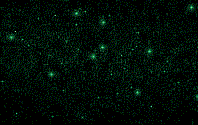
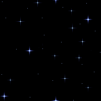
A Starcrash-style spacescape by Andrew Glazebrook
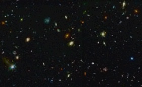
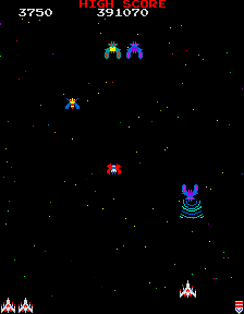 Galaga. On the linked page you'll see that one of the recognizable space backgrounds was actually taken directly from the game.
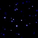
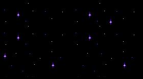
A great feature of the outer space background was that it could be just a two colors, maybe half a kilobyte in file size, but it would instantly give a futuristic mood for your page. So a bandwidth problem was solved as well.
However, the tragedy of outer space backgrounds is that, although they are magnificent, they don't fit with any concrete idea. They never did. Scientific texts, personal home pages, cinema programs, pathfinder image galleries, it's always wrong. Even the starships don't look authentic because it's wrong to hang pictures in the sky and there are no letters in outer space. Even if there were letters in outer space it would be impossible to read them. The dot over an "i" could be a star or a % sign and as for meteors...they're just too easy to confuse.
If you ever designed anything you know that an outer space background only looks good if nothing else is placed on it. If you were ever asked to redesign a page made at the end of the 20th century the first thing you did was remove the starbck.gif.
One of the latest, and thus documented, star removal surgeries happened in 2004. Here you see the 90's look of an online video shop.
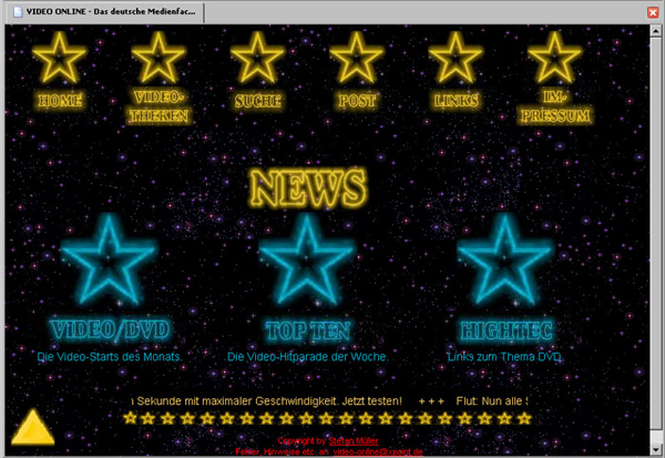
Follow the link to see a newer look:http://www.video-online.net/
One of the last survivors is http://www.kinoservice.de, a weekly updated website with the cinema programs for Stuttgart and Frankfurt. Every time I type this address I'm afraid that I'd find it remade without the stars.
Day by day the hope for an extraterrestial web future was giving way to the present reality of newspapers, magazines, electronic offices, online business, and other serious intentions. "Starry Night" backgrounds reduced proportionately; from being a symbol of the future they were turning into a sign of the web's early years. Its meaning shifted to the opposite: from future to past.
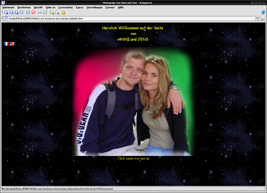
And it reminds us of the army of amateurs who, like Anni und Jens made a few pages in the last century and then forgot about them.
This is a very strong and recognizable association. I recently came across a professionally made promo site for theRenault Megan II Car of 2004, and it plays around with the spaceship design of the car. It looks like the work of a Renault fan and not a corporation because the use of stars on a website -even stars with Flash- stands for amateurs, not outer space.
Since stars shine outside of mainstream web culture they fit well with subversive or alternate projects and easily support the prefix "anti". Take the unamerican.com site for example, it's a sticker shop and antiamerican ideas portal. Stars give weight to this concept by placing the author in outerspace, viewing the whole picture, being objective.
And my projects page at the Merz Akademie, where I teach, is heavily decorated by outerspace motifs to stress that this is entirely my space and has nothing to do with the corporate identity of the institution.
See:
![]()